Health in Reach: Reinventing the Customer Experience
Redesigned the Customer Service Center for a federal healthcare program, transforming the digital experience for over 780,000 participants. Built on Salesforce Experience Cloud, the high-fidelity, functional prototype enhances navigation, interactivity, and accessibility. This human-centered redesign delivers a seamless, empathetic, and consistent experience—balancing user needs with functional and scalable design.
User Experience Designer
User Experience Researcher
Role
Duration
7 Weeks
Figma
Miro
Zoom
Skills
Wireframing
User Research
Strategic Thinking
Sensory Cue workshop
Usability Testing
Tools
21 Members form
6 different majors
Team
Problem
Identified
Solution
Click and jump to section
Project Overview
Discovery
Research
Ideation
Mid-fi wireframes
Usability testing
Hi-fi wireframes
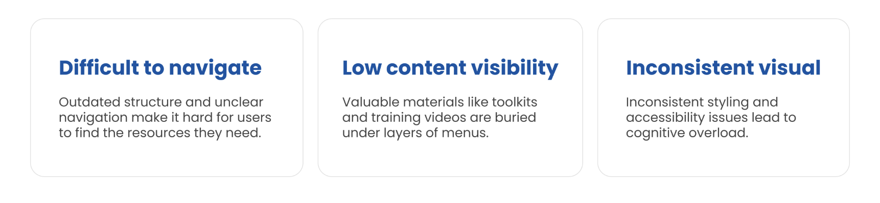
What’s The PROBLEM
Many users struggle to navigate the CSC site and access the right resources, like toolkits, videos, and training materials?

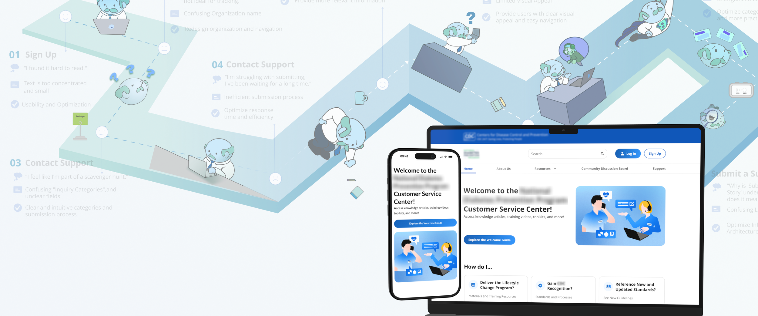
The suggested SOLUTION
Navigating with ease – a smarter first impression
Challenge
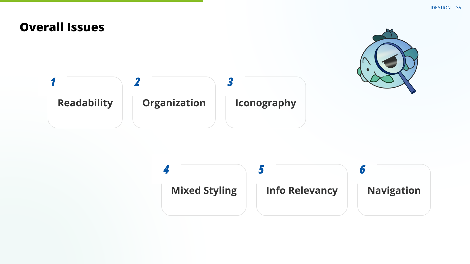
The original homepage was cluttered with text and repetitive icons, lacking visual hierarchy and clear CTA, which confused users and made key resources hard to find.
Solution
We've revamped the homepage to be more modern, clean, and visually compelling. But most importantly, we've made it easier and quick for organizations to navigate through the site and find the information they need.
Improved structure – easier access to essential resources
Challenge
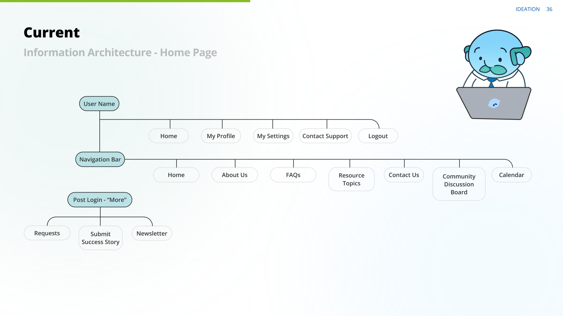
An overly long navigation menu, repetitive categories, and lack of visual separation made it hard for users to find relevant resources and understand content structure.
Solution
We reorganized the layout and refined the interface to improve discoverability, helping users locate the right information faster and with less friction.
Modern discussion board - Organized discussions & Better connection
Challenge
Users struggled to find relevant information. Posts visually blended together due to a lack of clear structure. The overall layout caused visual overwhelm, making it hard to focus on individual conversations.
Solution
We redesigned the board to be more modern, friendly, and approachable. Made it easier for organization to scan, engage with, and contribute to meaningful conversations.
Now, let’s see how we got there…
This project focused on a user-centered service design approach, integrating research and practical implementation to develop Tidy-Inn, a service aimed at decluttering and optimizing home organization. By gathering and analyzing user insights, the project aimed to streamline organization solutions, blending emotional well-being with functional efficiency.
The outcome was a service ecosystem featuring an interactive Tidy Store for sustainable product exchanges and a Tidy Calculator that leverages AI to estimate organizational needs accurately.
ABOUT PROJECT
-
Researched user pain points, mapped stakeholders, and structured insights using service design methods. Led Tidy Store's UX, refining navigation and building the "Sell and Donate" feature for circular consumption.
Designed the Tidy Calculator, using AI-driven image detection for transparent cost estimates. Created wireframes, service blueprints, and smooth UX flows for a seamless experience. Developed the project video in After Effects and contributed to presentation decks, effectively communicating the concept and process.
-
Understanding the role of behavioral psychology in habit formation helped shape the long-term usability of Tidy-Inn. It reinforced the importance of balancing functionality with emotional engagement, ensuring that organizational solutions were both effective and personally meaningful for users.
-
To ensure feasibility and effectiveness, the team prioritized key insights over broad exploratory ideas. This helped in narrowing down core features that had the highest impact. Some elements were simplified to maintain practical execution without compromising the service’s overall purpose and usability.
-
Ensuring a balance between emotional connection and functional efficiency in service features demanded continuous refinement. Coordinating workshops and aligning diverse team ideas required strong collaboration but ultimately strengthened the project’s outcome.
-
Introducing a community-driven engagement model, such as a rewards system for sustainable participation, would enhance user retention. Exploring B2B partnerships with real estate agencies, home organizers, and sustainable brands could expand reach and establish long-term service viability. Strengthening prototyping skills and integrating sustainability and accessibility would elevate future projects.

Project Timeline
Discovery
The Organizational Structure & Project Background of the Customer Service Center directly impacts its usability and effectiveness. In our secondary research, we examined platform architecture, stakeholder roles, and workflow barriers to understand how these factors shape the user experience of the site.
These insights lay the groundwork for improving resource accessibility and optimizing the platform to better support public health professionals in diabetes prevention.


Research
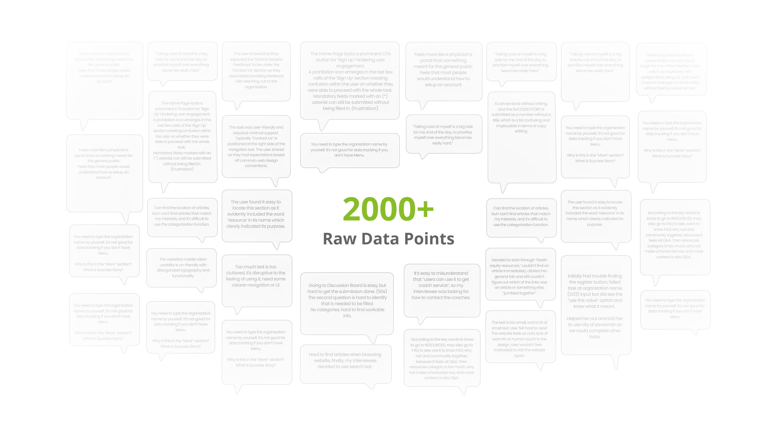
Our research aimed to assess the current National DPP Customer Service Center (CSC) website in order to identify usability challenges and improvement opportunities. We conducted website analysis, usability testing, and competitor research to evaluate the platform’s strengths and gaps.
Findings from task-based testing, site exploration, and industry comparisons informed our redesign strategy, ensuring a more intuitive and effective experience for both organizations and individual users.
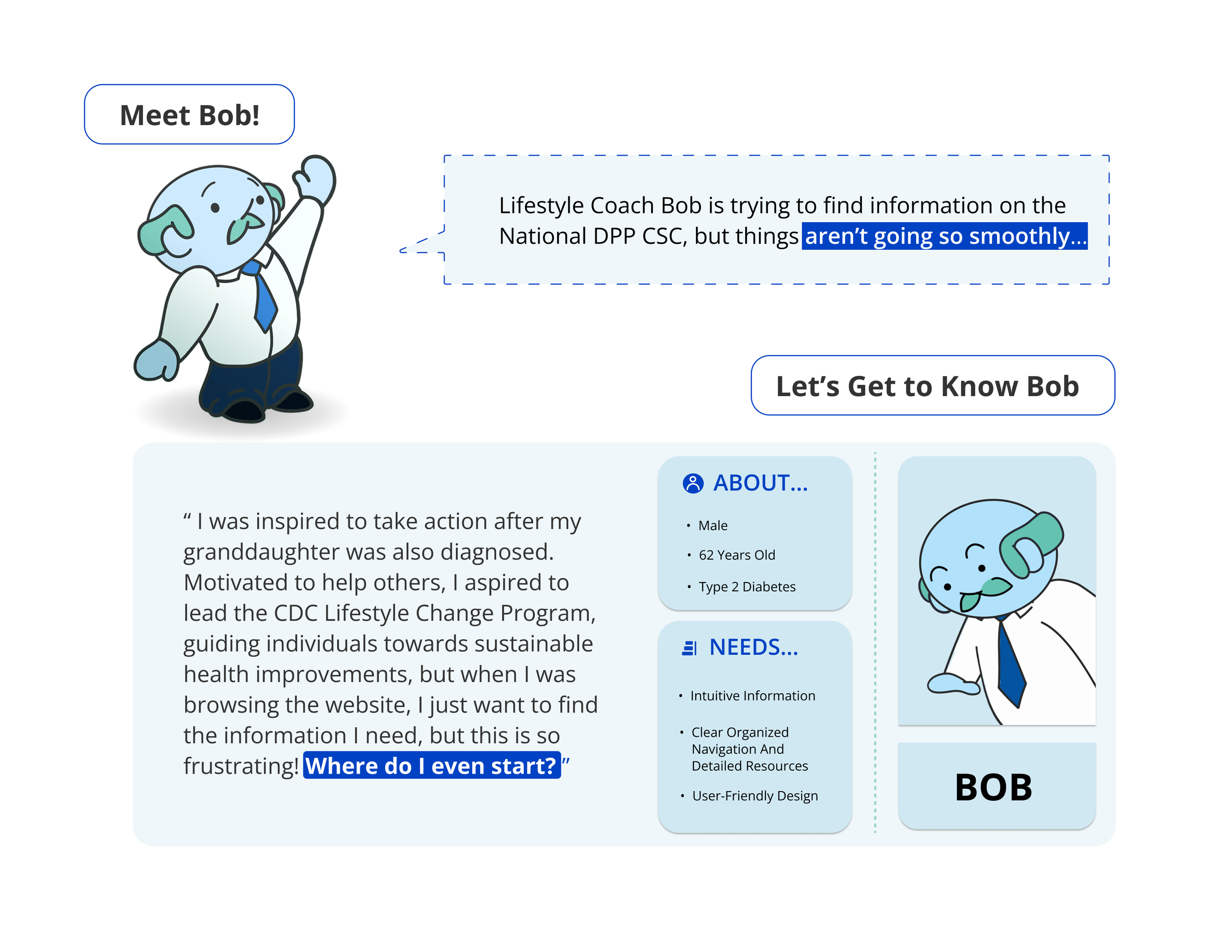
UNDERSTANDING THE USER
Why do facilitators of the National DPP need to visit the CSC?
How can we make their experience better?


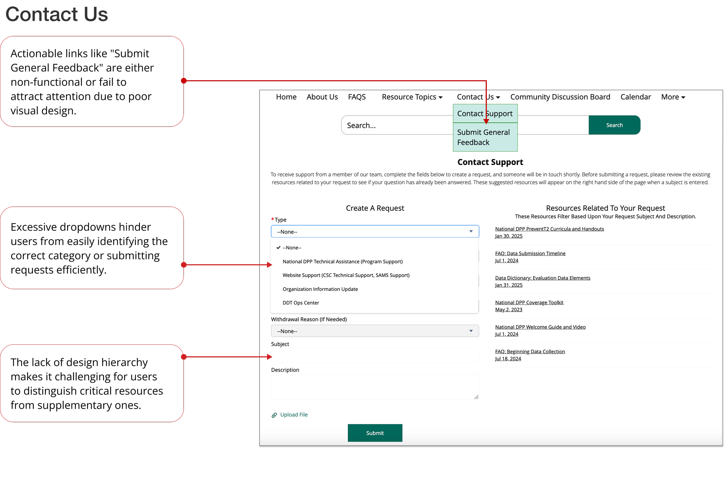
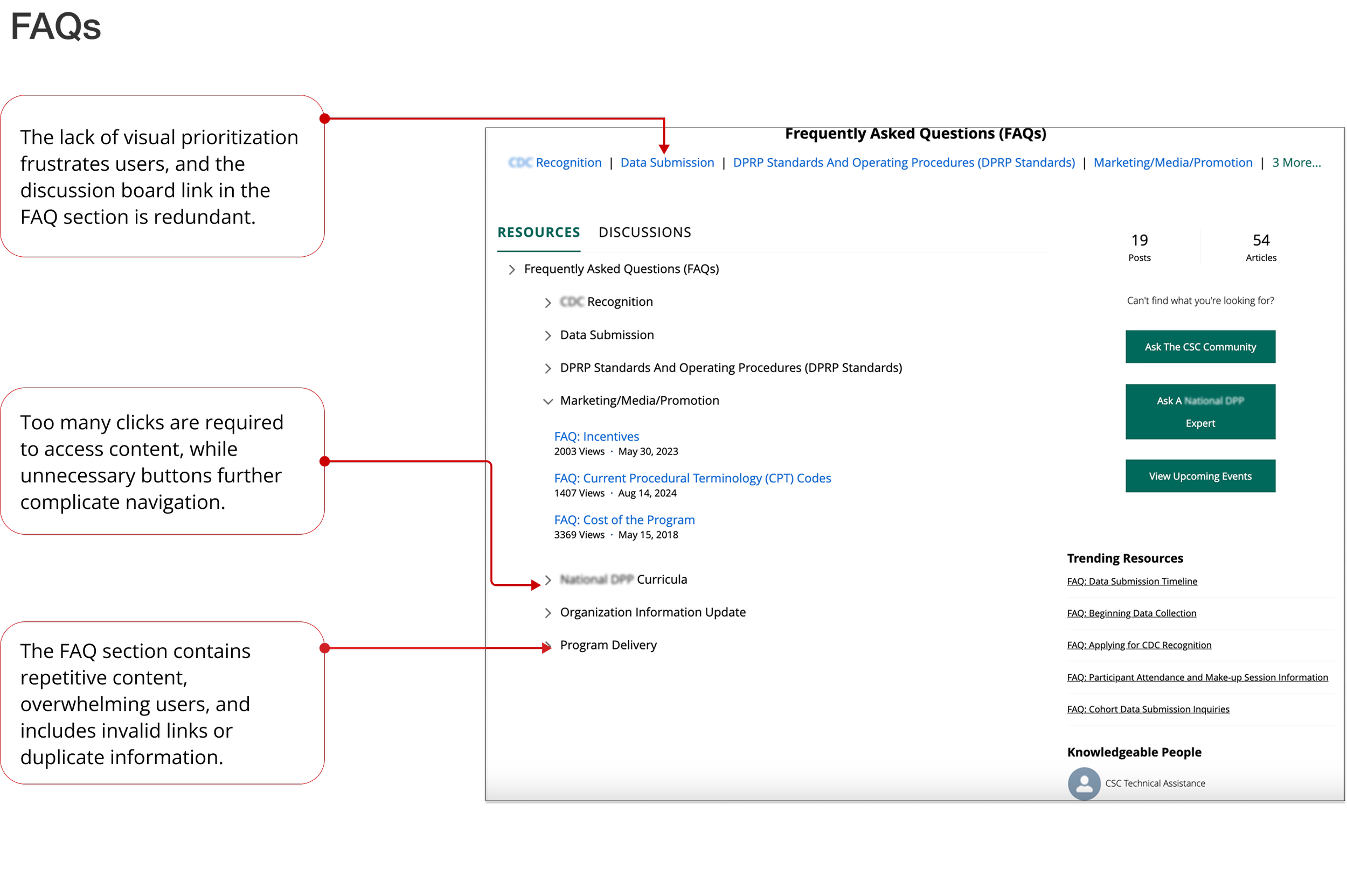
Website Analysis





Competitor Analysis



Ideation
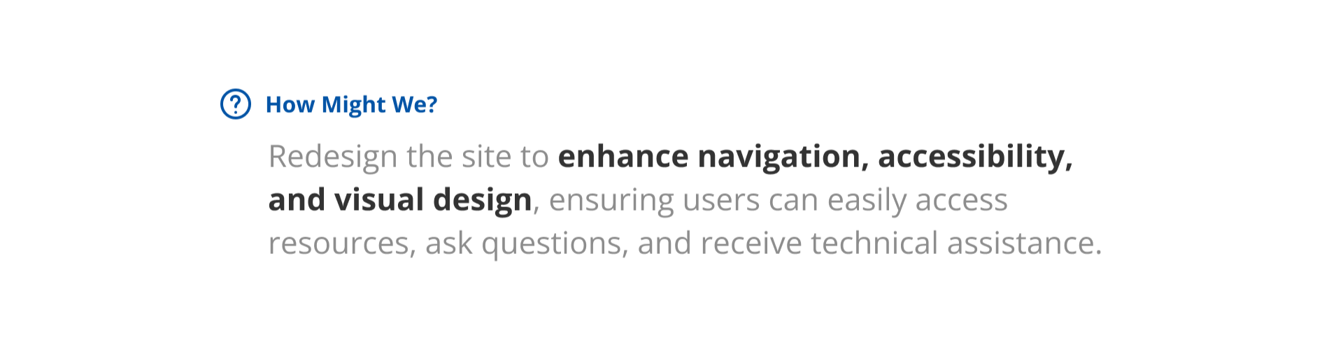
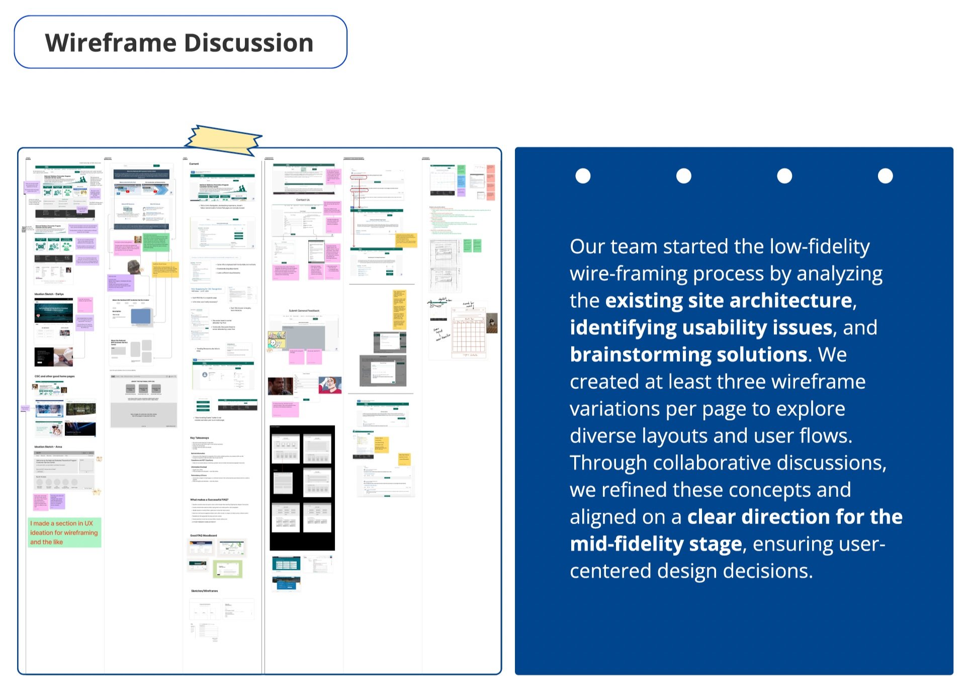
During our ideation phase, we transformed research insights into design concepts. We developed wireframes to establish core user flows and page structures, ensuring intuitive navigation. Alongside, we defined brand guidelines to create a cohesive visual identity, aligning typography, color, iconography, and imagery for a consistent, user-centered design decisions throughout the project.



Mid-Fi Wireframes
The Organizational Structure & Project Background of the CDC’s Customer Service Center (CSC) directly impacts its usability and effectiveness. In our secondary research, we examined platform architecture, stakeholder roles, and workflow barriers to understand how these factors shape user experience.
These insights lay the groundwork for improving resource accessibility and optimizing the platform to better support public health professionals in diabetes prevention.


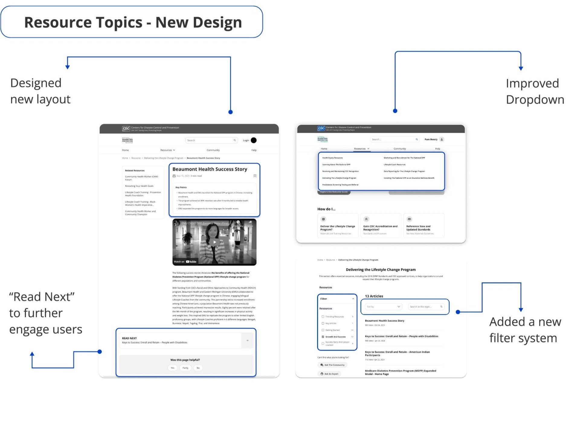




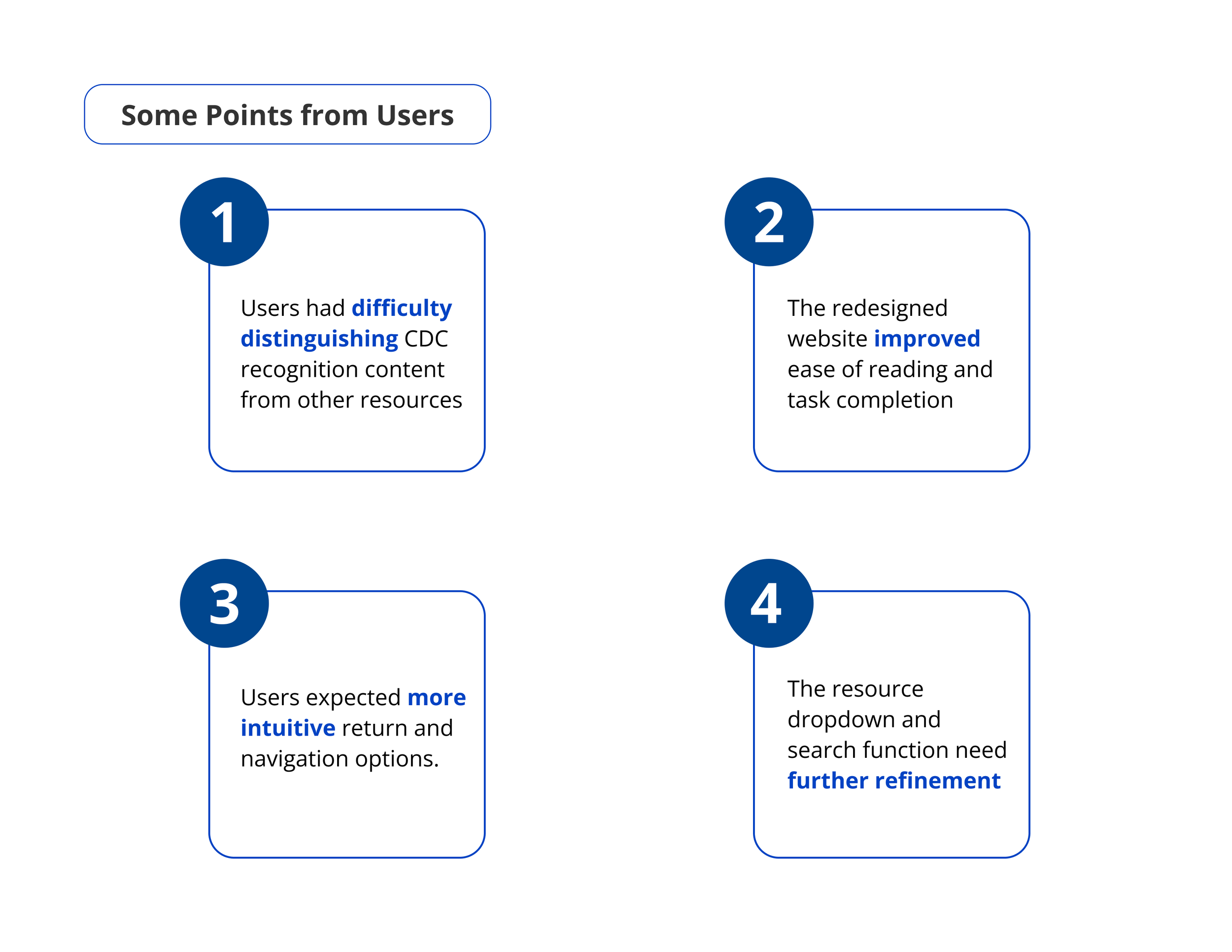
Usability Test
High-Fi Prototypes